I chose to examine the State Library of Western Australia website located at: https://www.slwa.wa.gov.au/
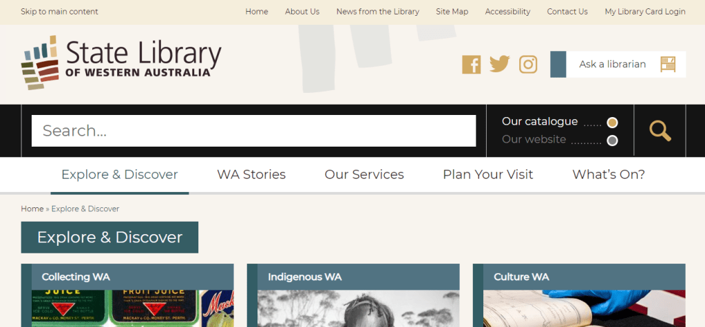
The website uses a mixture of organisation schemes. The “WA Stories” tab uses an ambiguous or more specifically a topical organisation scheme by subject. The “Our Services” tab uses a task-oriented functional scheme as well as an audience specific scheme (e.g. researchers/teachers/families). The “Explore & Discover” tab incorporates a topical scheme by subject, a functional task-oriented scheme as well as an audience specific scheme. Under each tab it would be beneficial to choose one type of organisation scheme to maintain the integrity of the section and reduce confusion among users. Furthermore, the website structure is hierarchical as each tab contains multiple levels that users can go up and down to access.
The website adheres to some of the W3C web accessibility guidelines with a text equivalent under important images, changeable text size and clear natural language use (Web Accessibility Initiative, 2019). Users also have the ability to translate the text into another language. However, the website does not have captions for videos.
The overall design is good, clear and simple with large font (Al-Qallaf & Ridha, 2019) and the colour scheme is consistent with contrasting colours and ample white space (Scheeren, 2015). However, the homepage is quite cluttered with a lot of images/tabs/sections. That being said, text content is kept to a minimum with only the critical information underneath each tab and/or image. The toggle search bar is big and consistent at the top of each page, Web 2.0. technologies (Facebook/Twitter/Instagram) are present (Scheeren, 2015), and there is a “skip to main content” bar located in the top panel which allows users to skip sections that are not relevant to them (Yoon, Hulscher & Dols, 2016). This is particularly useful for patrons using screen readers (Yoon et al., 2016).
In order to improve this website it would be useful to add a chat box function to increase engagement between users and the library, ensure organisation schemes are consistent under each tab to reduce user confusion, and declutter the homepage by removing duplicate content. For instance, on the homepage there is a “What’s On” tab followed by a “What’s On” slideshow reel at the bottom right-hand side of the webpage.
References
Al-Qallaf, C. L., & Ridha, A. (2019). A Comprehensive Analysis of Academic Library Websites: Design, Navigation, Content, Services, and Web 2.0 Tools. International Information & Library Review, 51(2), 93–106. Retrieved from https://doi.org/10.1080/10572317.2018.1467166
Scheeren, W. O. (2015). School Library Websites. In Technology Handbook for School Librarians (pp. 150-161). Portsmouth: ABC-CLIO. Retrieved from https://ebookcentral.proquest.com/lib/unisa/reader.action?docID=2098544&ppg=182#
State Library of Western Australia. (2019). State Library of Western Australia. Retrieved from https://www.slwa.wa.gov.au/
Web Accessibility Initiative. (2019). How to meet WCAG (Quick Reference). Retrieved from https://www.w3.org/WAI/WCAG21/quickref/ Yoon, K., Hulscher, L., & Dols, R. (2016). Accessibility and Diversity in Library and Information Science: Inclusive Information Architecture for Library Websites. The Library Quarterly, 86(2), 213–229. Retrieved from https://doi.org/10.1086/685399
Yoon, K., Hulscher, L., & Dols, R. (2016). Accessibility and Diversity in Library and Information Science: Inclusive Information Architecture for Library Websites. The Library Quarterly, 86(2), 213–229. Retrieved from https://doi.org/10.1086/685399

Excellent discussion, including recommendations for improving the website. I hope you found this activity useful.
LikeLike